Colorful Vintage + Modern Kitchen Renovation in Tulsa, OK
/Well, I can't believe it. Our kitchen is actually done. Done, I say! It's been so long, I'm ashamed for you to look back to see the date of the "before" kitchen post.
Okay. It was April 30th.
So that means the kitchen's been about six months in the making. Now to be completely fair, our kitchen has been functional since mid July, but the "finishing touches" took nearly as long as the bulk of the demo/installation. But whatever. It was our first renovation and we went at it without a general contractor and it's done now, so who cares if it took six months? Who's even counting, right? (I can say that now that it's over, because I did care. I was the crazy woman counting!).
Now, before we get to the photos, let's take a very short trip down memory lane. Okay, here we go.
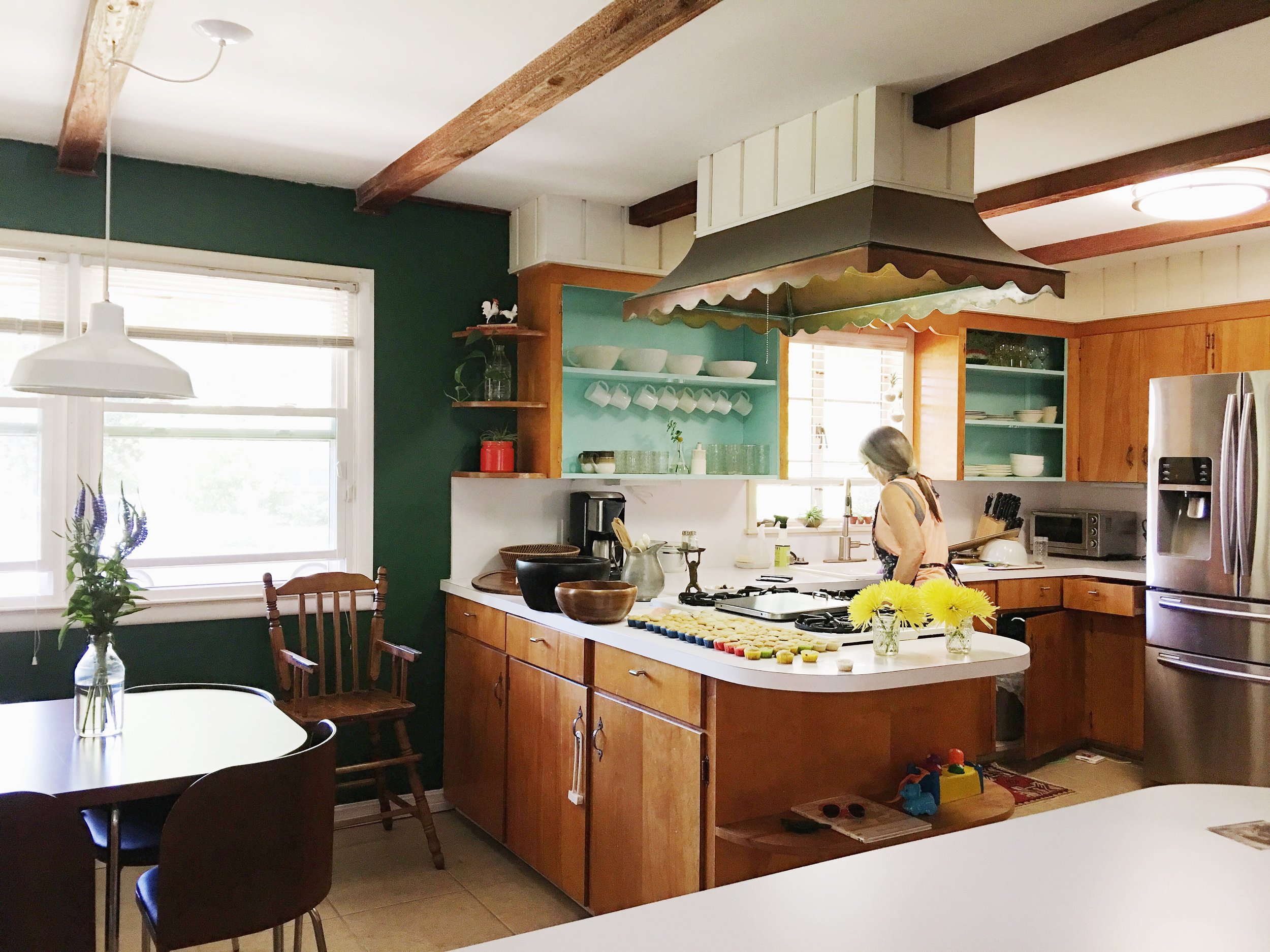
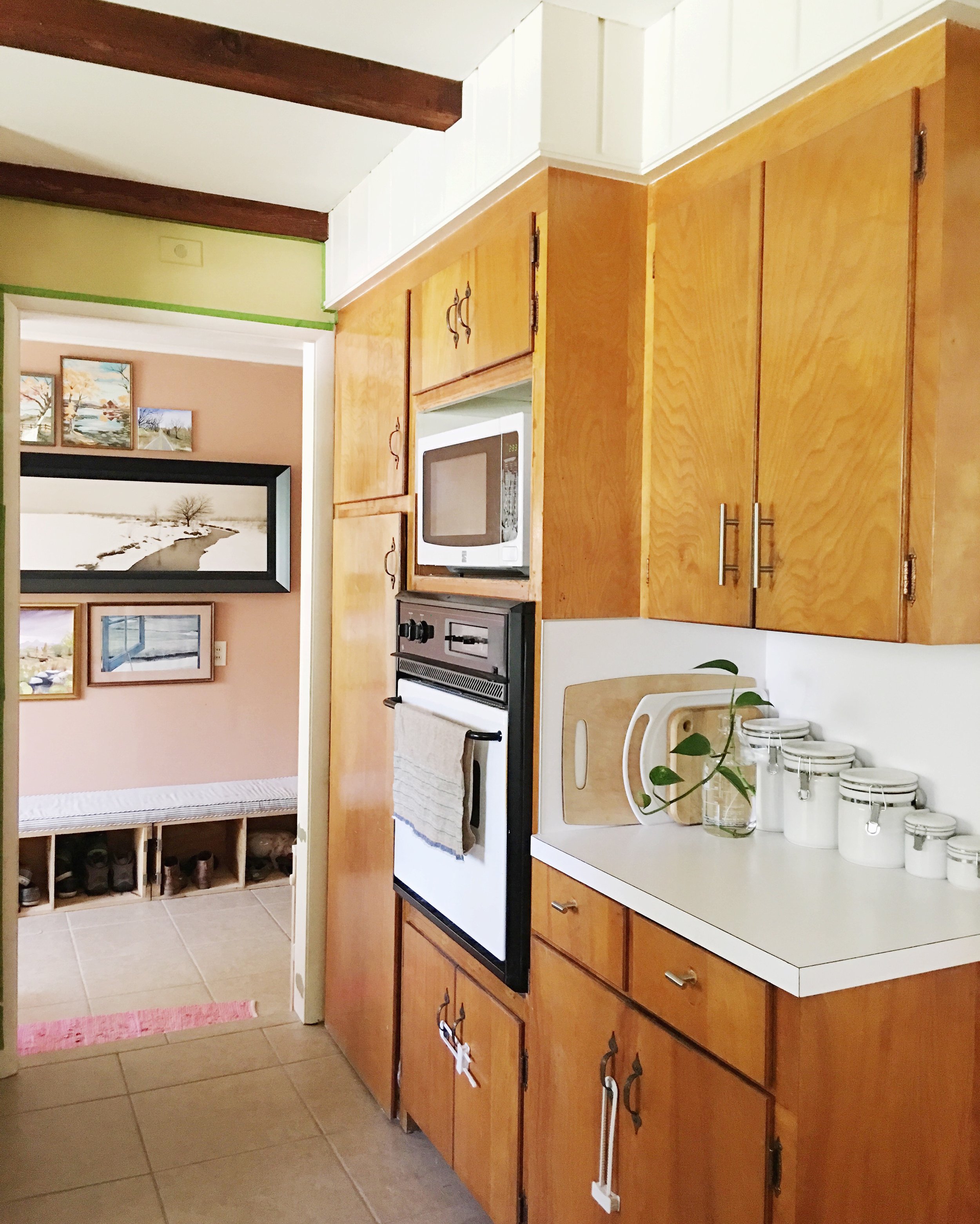
Our 1950s kitchen looked like this before. It was definitely not the worst kitchen ever, but was kinda blah compared to the rest of the house and also had some functional issues.
Here we are down to the subfloor. I remember we kept a big plastic tub over the hole that night so no varmints would visit us.
Here's little Caroline revealing the new floor my brother installed. What a good day that was!
Cabinet installation day in May with Micah of MJM Construction was another big highlight for us. It really made the new kitchen feel real!
My overall goal was to update the kitchen to make it more functional for our family while blending its new aesthetic with the 1953 style of the house. I wanted to describe my kitchen as modern, warm, colorful, bright, inviting, and full of character. It took nearly a year of research and a design consultation with Ashley Whiteside before we even pulled out the first cabinet. We'd never done a renovation before and it was a daunting task to us.
Though we didn't change the overall footprint of the kitchen, we made several layout changes that have been sooo helpful with how we use the kitchen on a daily basis. Also, I'm glad we lived in our house for a couple years before doing the renovation so we knew the things about the kitchen that didn't work for us and how we could make them better. Now without further adieu, let's start the tour.
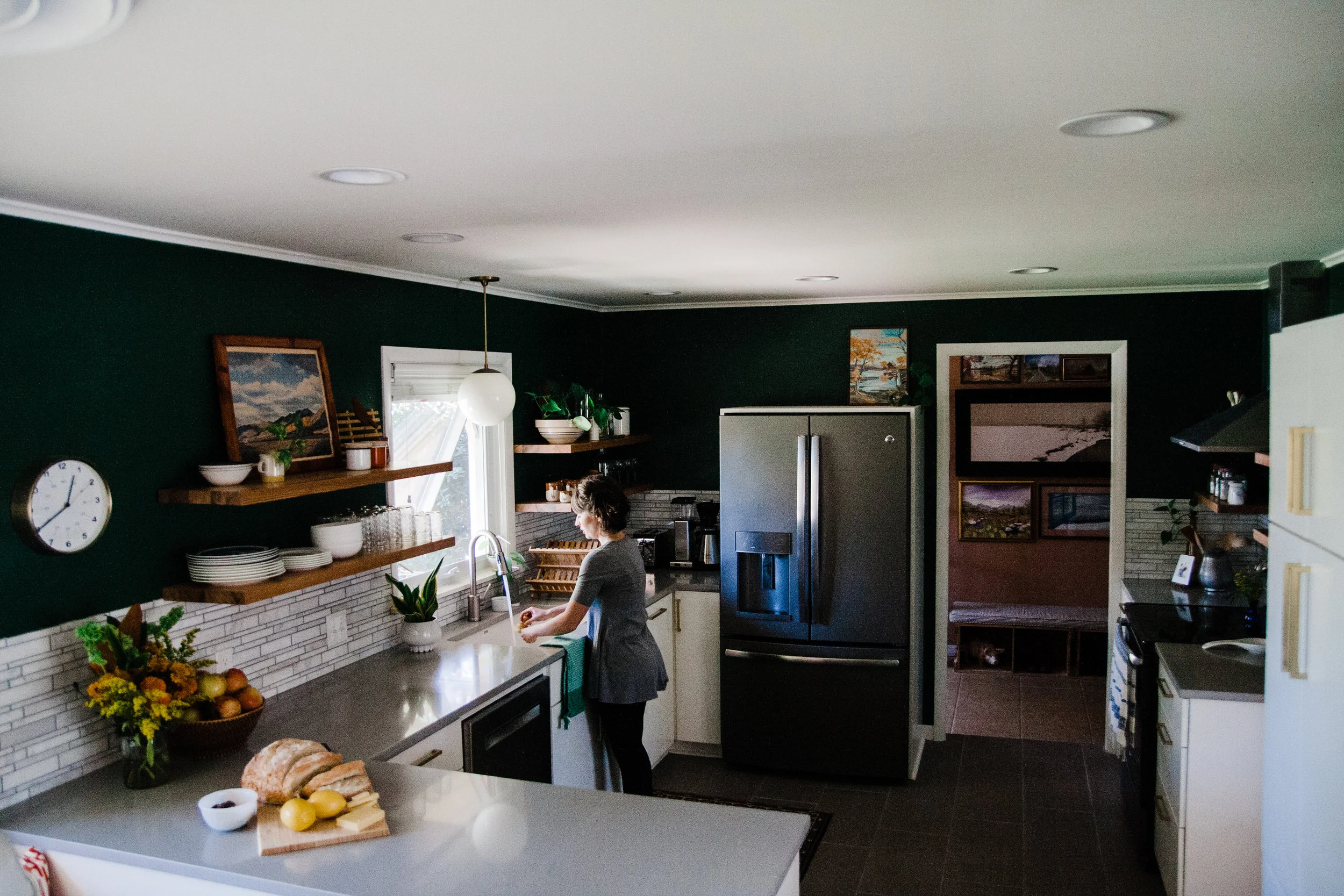
We didn't change much about the layout in this first part of the kitchen. The main difference layout-wise is that we pushed the peninsula out towards the eat-in area to allow room to the left of the dishwasher so that you an actually put up dishes. We also removed the stove top/vent hood from the peninsula making it just a loooong stretch of countertop.
Before
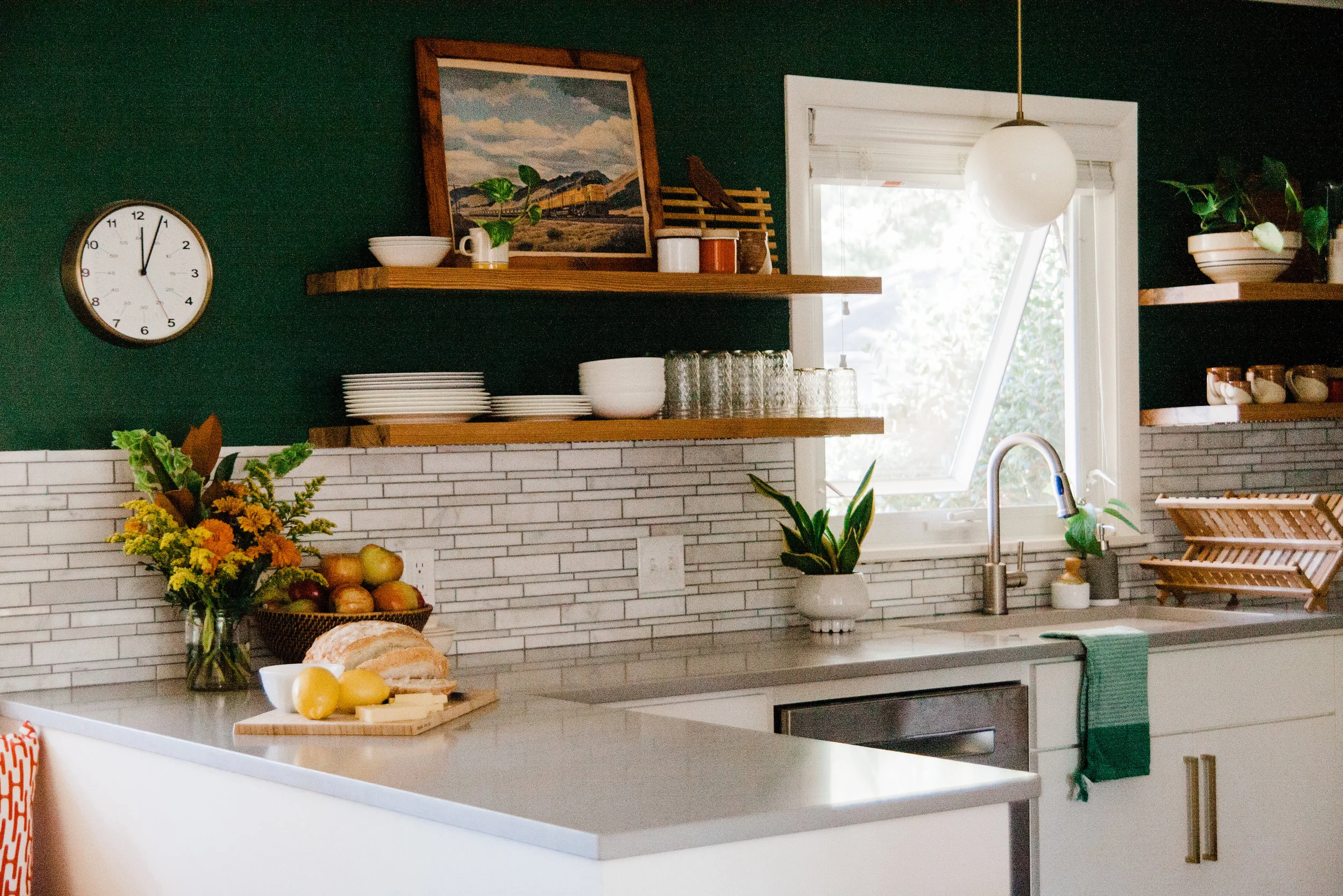
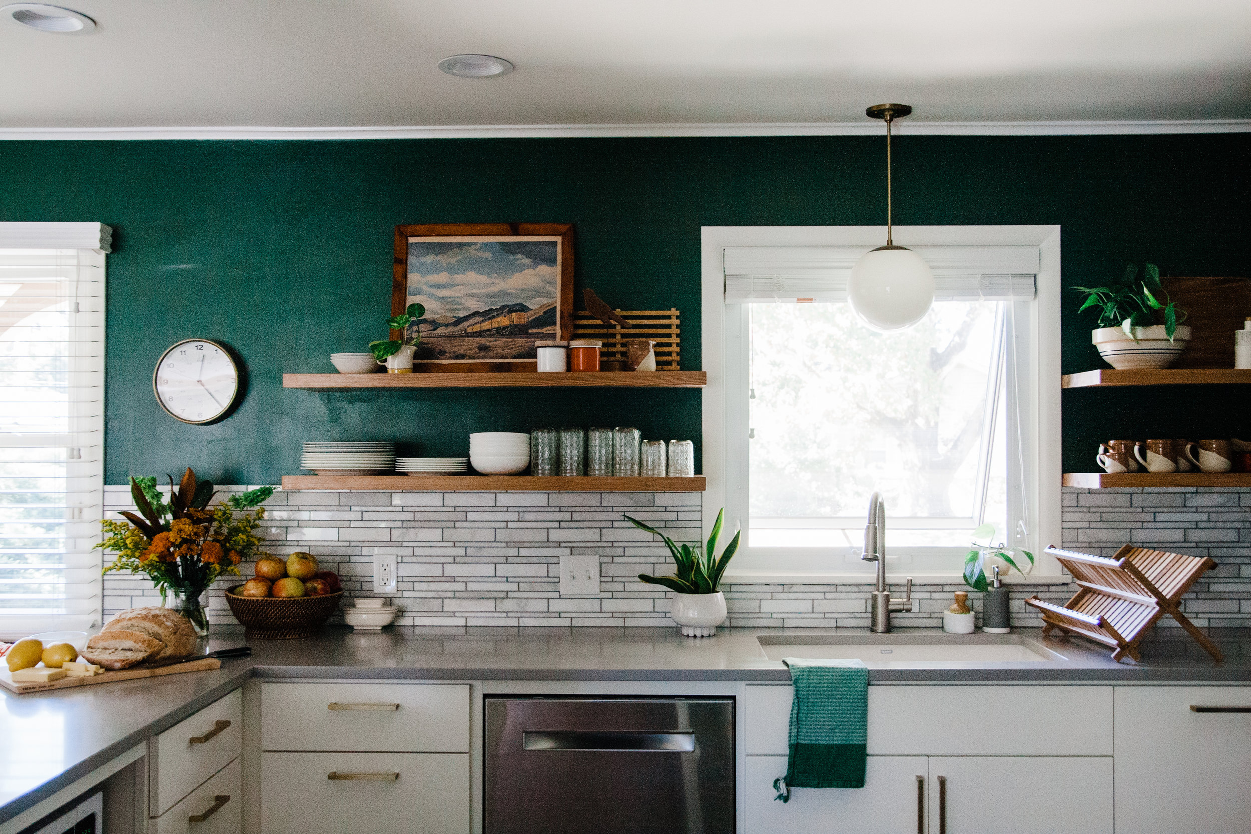
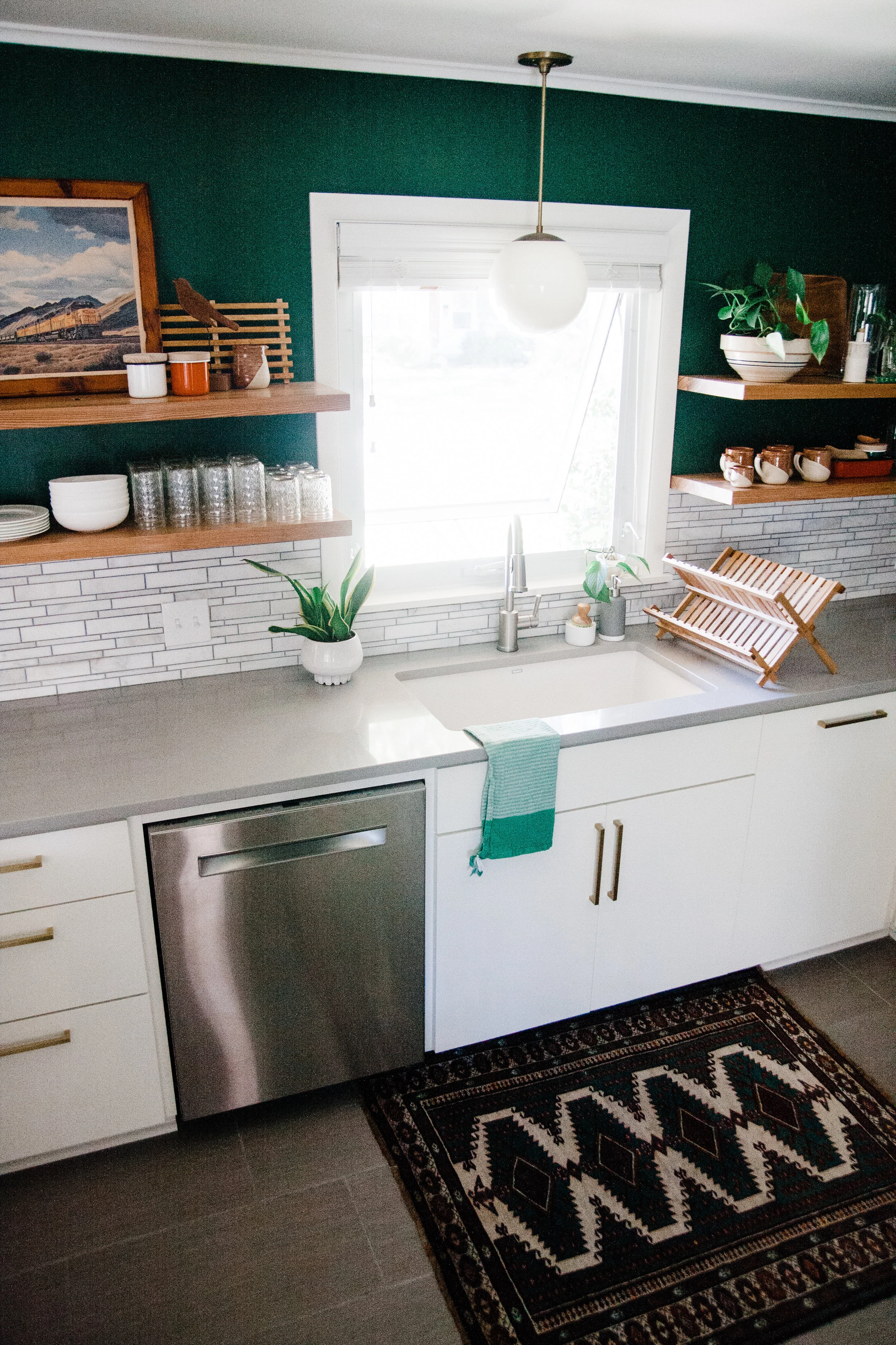
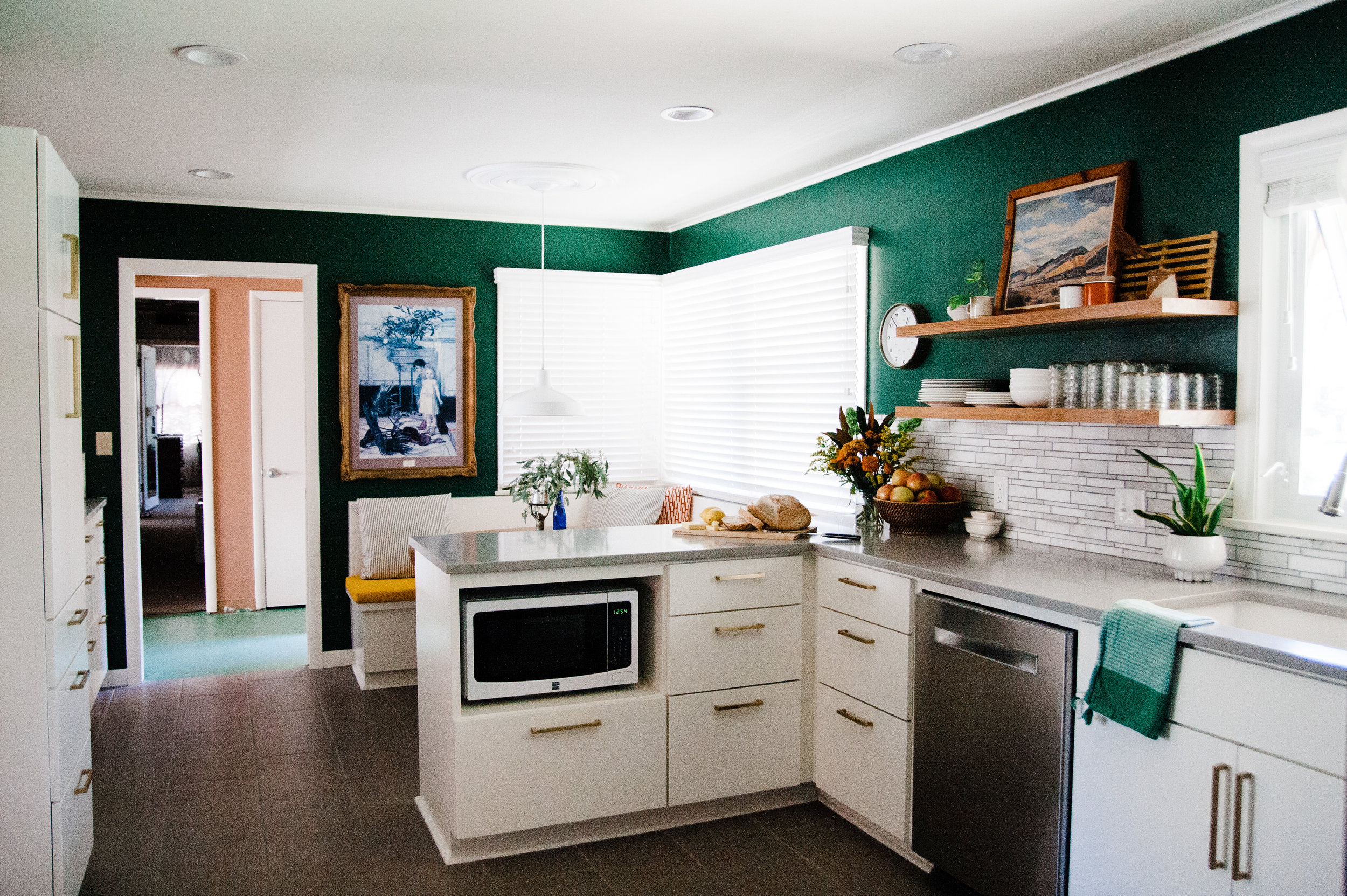
After
I love that the peninsula no longer contains the stove top. We do most of our food prep on this stretch of counter from chopping vegetables to packing lunch boxes. I love that it looks out over the eat-in area and my family can easily talk to one another while one of us is cooking.
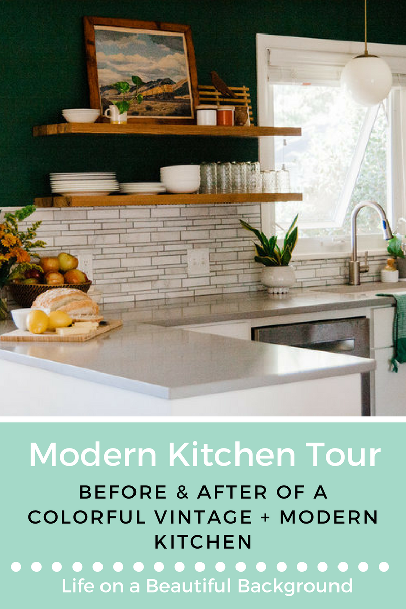
The floating shelves are beautiful, but they were a pretty intense DIY project completed by my father-in-law and husband. I'm not sure we (they) would do it again.
I found this framed vintage train print at the Tulsa Flea Market mid-renovation and knew it would be perfect in the new space.
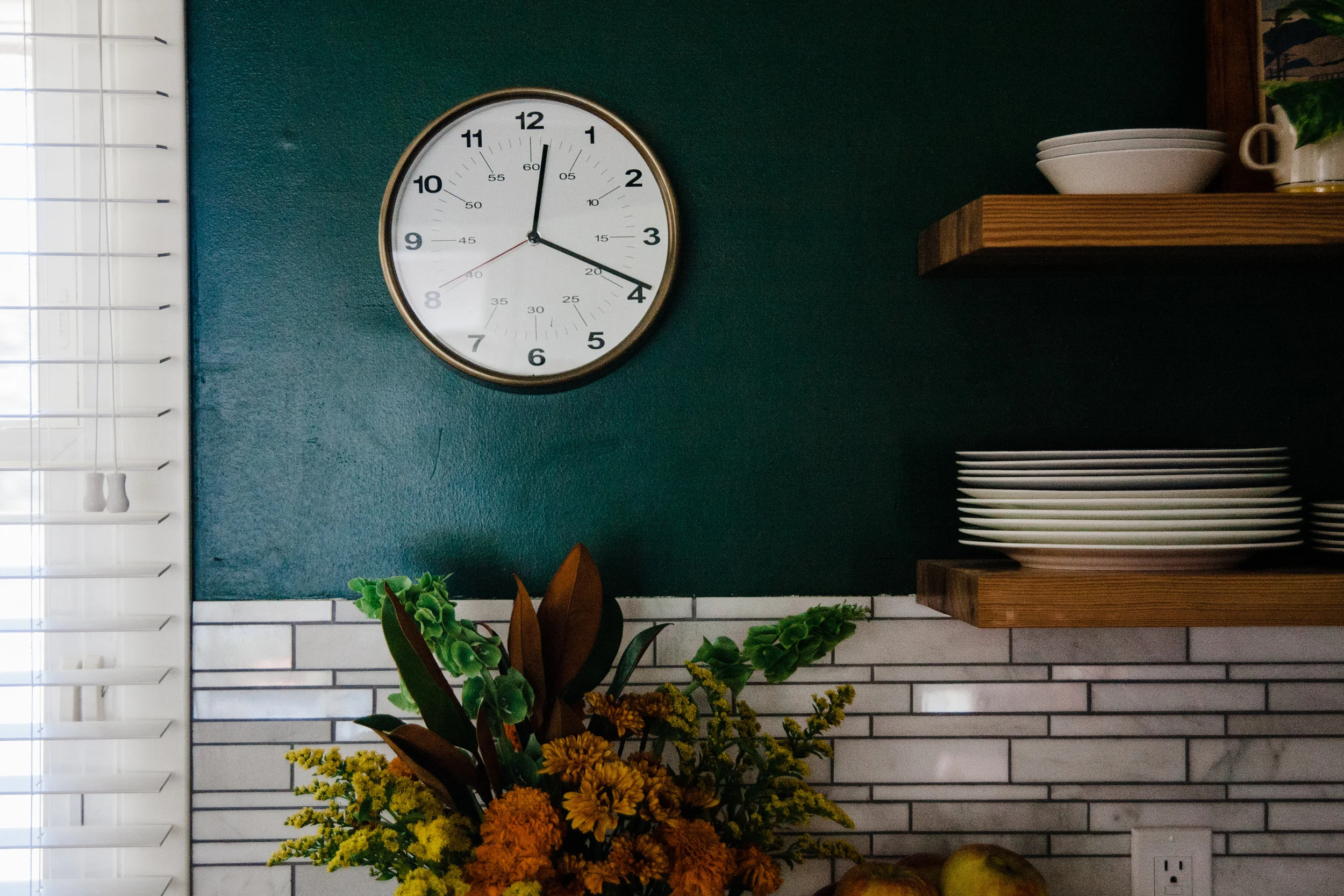
I'm glad that I didn't chicken out on painting the walls green. I love the blend of colors we have going on while still maintaining the light, calm and airy feel.
Look at all that space! There is a whole column of drawers to the left of the dishwasher! Now I can easily put away the dishes.
During our design consultation with Ashley Whiteside, she recommended this beautiful backsplash that mimics the stone of our fireplace and home exterior. Thank you, Whiteside!
Look at me slicing that bread. Go, Ashley, go.
I love that the appliances are nestled back out of the way in this corner, but are still accessible for daily use.
We installed a new window that was a solid piece of glass (rather than divided). It really changed the look of the house inside and out.
Our dear friend and local artist Kris of Foxy Pots made our coffee mugs and surprised us with a miniature one for Caroline. She uses it every day!
The gorgeous vintage rug was sourced by Gretchen of KY Rose Designs. Gretchen has such a beautiful, curated collection of vintage rugs.
We bought our fridge on sale in the scratch and dent section, so the sides of it weren't very nice looking. To solve this problem, we created a case for our refrigerator without any upper cabinets. I was afraid this was a weird idea because I couldn't find many examples of what it would look like, but Whiteside and Daly reassured me it was a good way to go and I'm so glad we did. I love how it turned out.
I love the view through the kitchen into the mudroom. The mudroom's landscape gallery wall feels like artwork for the kitchen too.
Before: this wall housed the pantry, oven and microwave
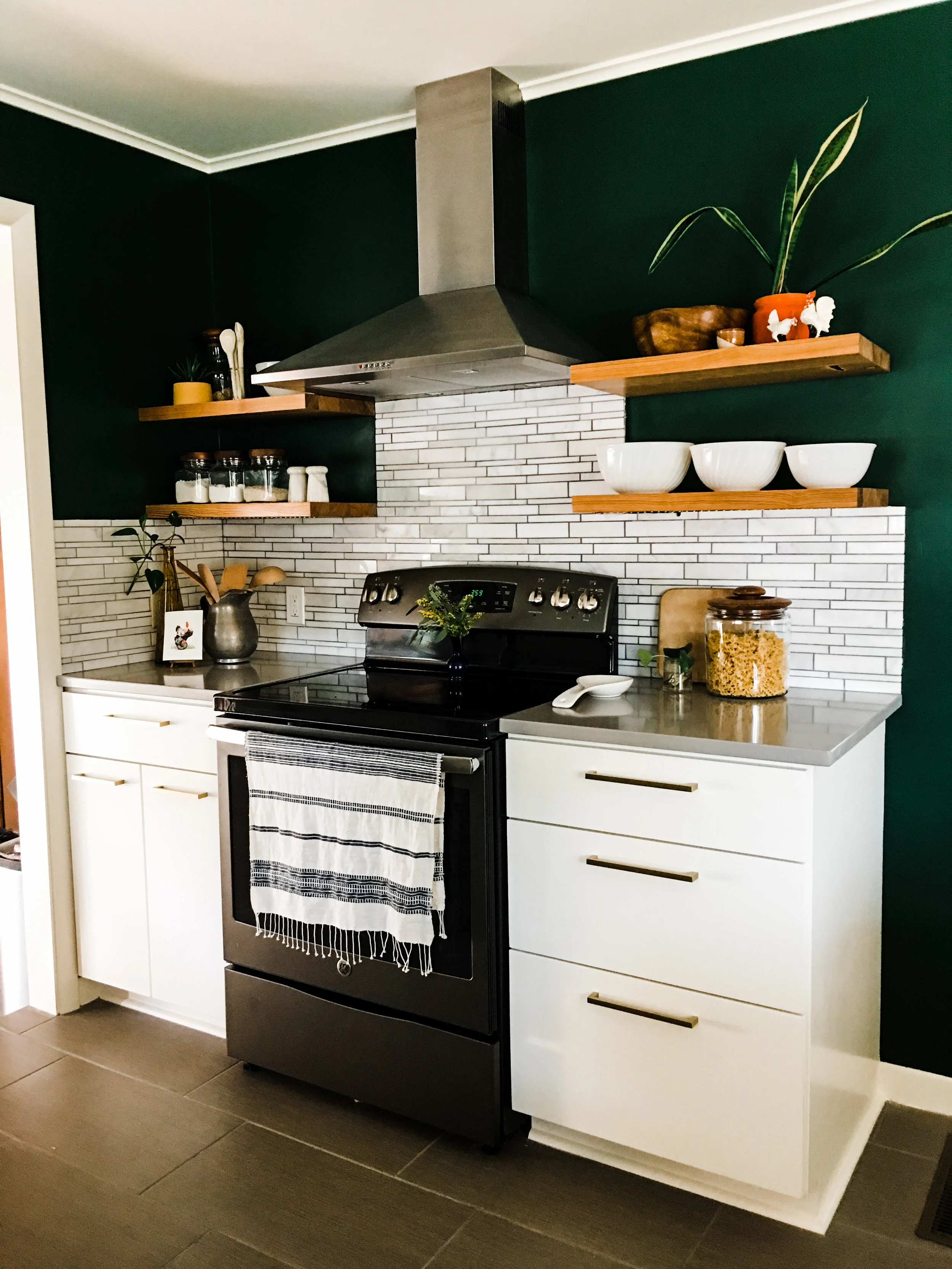
After: the stove/oven is the star
Now this part of the kitchen is quite different layout wise. We used to have a separate stove top and oven, but we bought a stove/oven combo for the new kitchen. This way we only had to find a location for one appliance instead of two! We relocated the microwave (you'll see where in a moment), and then we made the best decision ever. We relocated the pantry (which used to be to the left of the oven) to the other side of the kitchen that was dead space between a doorway and a pass-through. This allowed us to have counter top and drawers on both sides of the oven instead of only one. Without relocating the pantry, I think the stove/oven/vent hood would have looked lop-sided and squished. This way, the cooking area gets its own dedicated space. Moving the pantry was, by far, my favorite change in the kitchen.
Patrick and Caroline gave me that little chicken card for Mother's Day last year.
The chicken salt & pepper shakers belonged to my great grandmother.
Before
After
Alright, so now you can see where we hid the microwave. I wasn't sure how we'd all feel about having the microwave so much lower, but it's really no problem at all. I'm glad we tucked it away under the cabinets to make room for more important things. Also, I'm so happy that huge vent hood is gone!
So many drawers! We have 90% drawers in this kitchen per the suggestion of Micah from MJM Construction. Never going back to all cabinets.
See that tall column of cabinets to the left just past the door? That's the new pantry.
Here's a better photo of the pantry. There used to be NOTHING in that space before- just a blank wall between the door and the pass-through. Can you believe it? Not only did we make more efficient use of space, but the location in the middle of the kitchen, equally close to the eat-in table and the stove, is even more perfect than before (in the far corner).
Before: this was taken a few months after we moved in
After
We had this pass-through to the dining/living area in the old kitchen, but the countertop didn't extend out, so it wasn't functional as a bar. With the renovation, we extended the countertops out a foot and added barstools. It really just made sense to do this.
Here's a peak into the kitchen from the entry way. I painted the entryway peach to match the mudroom (on the other end of the kitchen).
Now my other favorite part of the kitchen–the eat-in banquette! We had a table set here before the renovation, but adding the bench seating used our space more efficiently and made eating in here so dang cozy. I struggled with what sort of table to use and finally realized I needed a pedestal table (due to the benches) and needed a larger one than I imagined. I was telling Daly my table finding woes one day when she says, "I just saw a round honey-colored pedestal table at the thrift store." "What!?" I exclaimed. "And it had a brass base," she added. My head exploded. "Why didn't you get it!?" Daly didn't know why she hadn't got it for me, but she corrected that mistake right away and arranged its pick-up for me right then and there. Thanks, Daly.
Before: The walls were green, but everything else is so different!
After: Another Ashley Whiteside brain child: have the bench run right up against the cabinets. Oh, this small detail made the whole setup look like it was meant to be. Also, you may remember me talking about the color "school bus yellow" a lot a few months ago. Well, these bench cushions were my outward expression of love for this color.
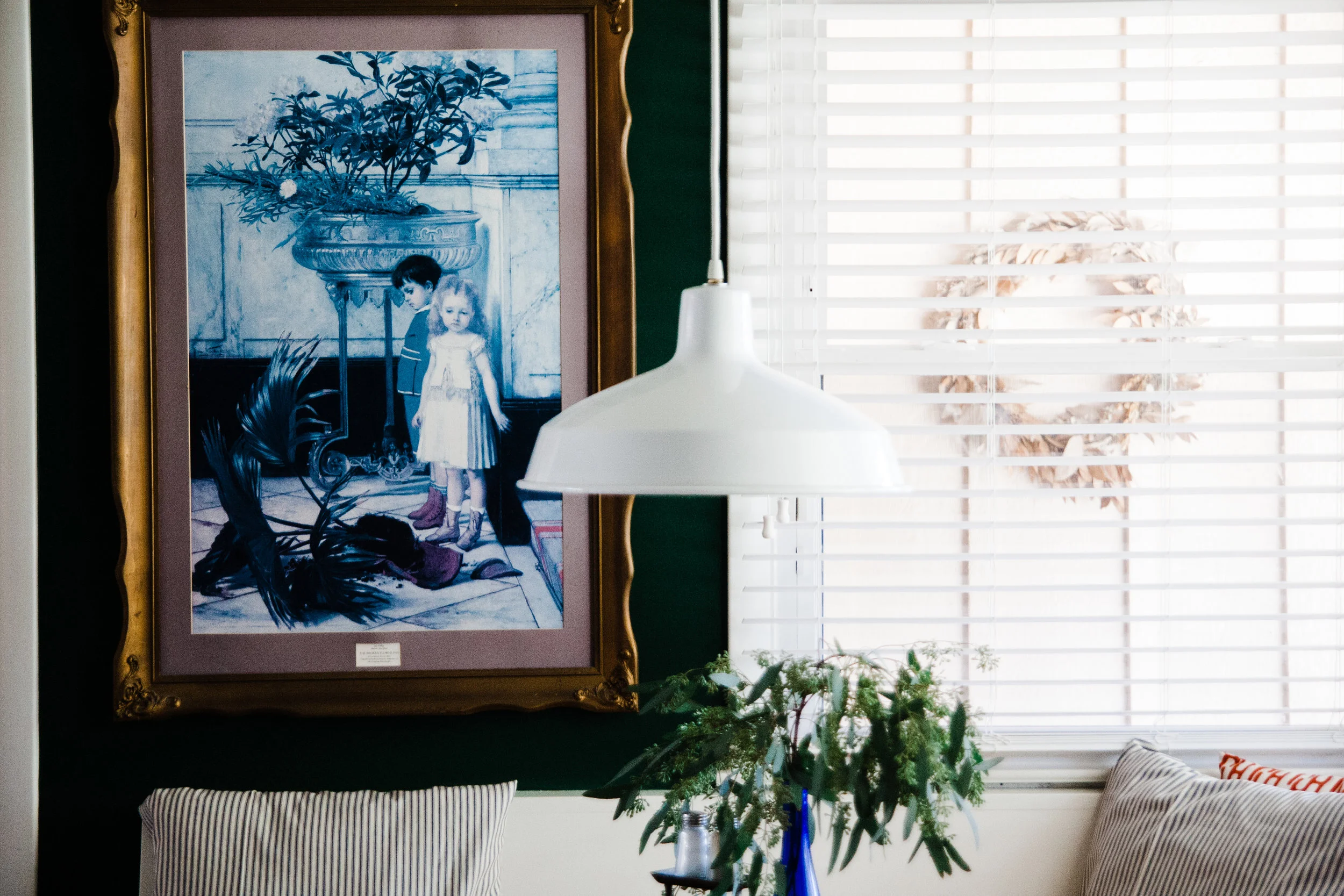
Fun, embarrassing story. I told the electricians where to hang the light when I thought we were going to have a 3ft wide table instead of a 4ft table (which is what we ended up with). Instead of trying to patch our brand new ceiling after my husband re-centered the light, we used this inexpensive ceiling medallion to hide the holes. I think I actually like it better with the medallion now!
Well, it's been a long six months, but it was worth it. We are really enjoying the new space and thankful to have it. Number one thing I do not miss is jumping up to turn on that damn huge vent hood.
Below are our kitchen sources. Feel free to comment if I missed one!
Kitchen Sources
Wall paint- Sherwin Williams Evergreens // Cabinet paint - Sherwin Williams Dover White // Floor Tile - Home Depot // Banquette Cushions - fabric (similar), Joanne’s, upholstery, Janie’s Upholstery // Banquette pillows - Owl & Drum, Joanne’s // Pedestal table - thrifted // Countertops - Samoa Quartz // Cabinet Hardware - Schoolhouse Electric // Cabinetry- MJM Construction // Design Consultation: Whiteside Art & Interiors // Backsplash - Mission Stone & Tile // Warehouse light - vintage, Retro Den // Composite Sink - Amazon // Globe Pendant - Schoolhouse Electric // Hand towel - Jenkins & Co. // Coffee mugs - Foxy Pots // Serving spoons, coffee spoon, vessel with cork top - Mudhouse Studio // Enamel canister set - Schoolhouse Electric // Appliances - Hahn // Dish rack - Lowe’s // Rug - KY Rose Designs // Blinds - American Blinds // Ceiling medallion - Amazon // Brass Wall Clock - Target // Yellow Concrete Planter - The Makerage // Bar stools - vintage, Retro Den // Floating shelf tutorial - Bigger Than the Three of Us // Floating shelf hardware -SilicateStudio
Answer the questions we ask our home styling clients to get them thinking about their homes!


