Before & After: A Boring Guest Room Becomes a Colorful, Artfully Collected Haven
/The guest room felt dull and lifeless
When we first met Annie, we knew good things would come of our collaboration. She's laid back, funny and kind and had excellent taste with a treasure trove of an art collection packed away in her closets just waiting to be released.
Annie wanted our help with the guest room in her home. She claimed she just "plain old [did] not like the guest room" as it was dull, lifeless and the place where old furniture went to live. She had hopes of adding rugs, textures, artwork and lighting to liven up the space, making it feel cozy, comfortable, and sophisticated. Annie wanted the room to not only serve as a comfortable space for guests, but also as a work space for her husband and sons.
We collaborated to make decor decisions in line with Annie's aesthetic
We were excited to collaborate with Annie to transform her guest room into a space for which she felt great love instead of distain. Like we said, Annie has great style and beautiful pieces and so our sessions took on the form of encouraging her ideas, suggesting our own, and working together as a team to make and execute decor decisions she had held back on previously. Before we get into the changes we made, let's take a look at the "before" photos of the guest room.
Annie said the artwork felt awkward in the room.
She had dreams of replacing the light fixture with something more her style.
Annie's positive comments about the room before our session included the multiple windows and ample storage space. That was about it.
We added color, texture and interest through artwork and textiles
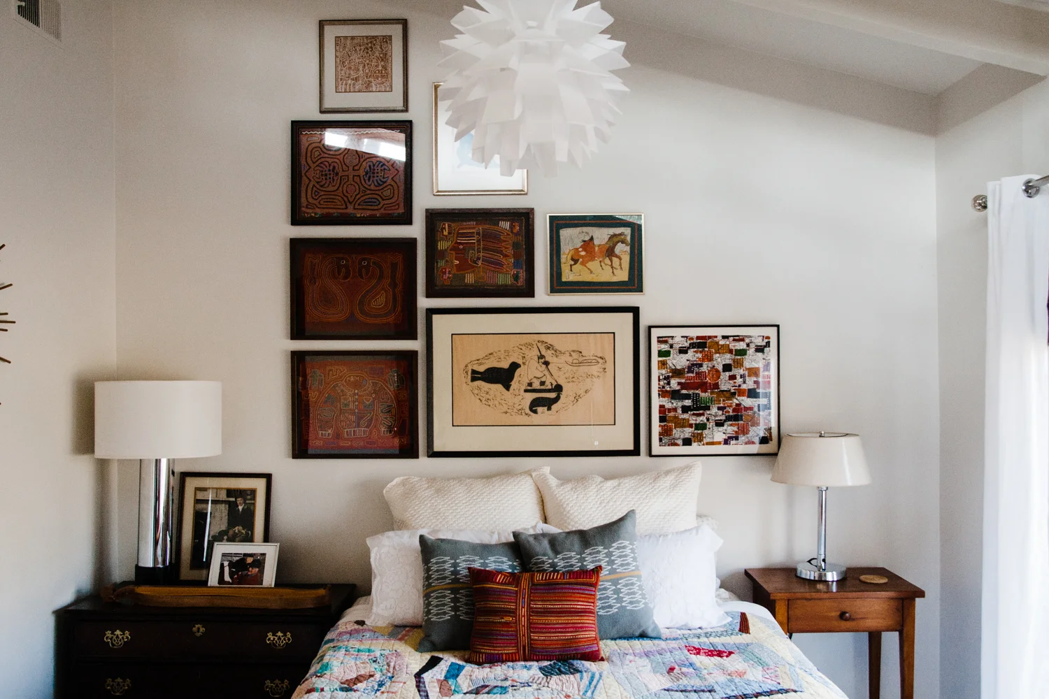
The most impactful change was creating a gallery wall of artwork above the bed. Annie has a beautiful art collection, but had little of it displayed when we met her. The first step, we all agreed, to transform this dull guest room was artwork! We selected pieces that complemented one another and contained colors and subjects Annie felt fit the space. Then we got out the hammer and nails and arranged them to mimic the lovely, asymmetrical lines of the ceiling. Often we suggest clients hang art themselves or with a trusted family member if they need exacting precision, but Annie is so laid back and she agreed to our disclaimer for art hanging...sooooo, while we did use a level and measuring tape, one of the three of us did at one point stand on a basket on the mattress to reach the tip top artwork position. We all lived, and the wall looks amazing.
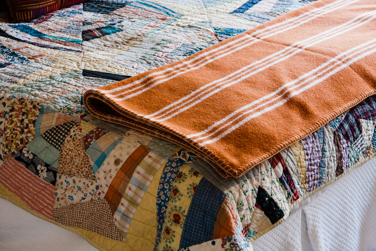
The second most noticeable change was adding layers of colors and textures to the bed linens. Annie already owned all of these textiles; we merely raided her closets and brought out beautiful, meaningful pieces she had stored away. The mix of pattern and color on the new bed linens added depth and interest to the once bland space.
Annie wasn't a huge fan of the matching night stands, so we swapped them out.. The new night stands (which we found in her house) were different sizes and had different wood tones, adding unexpected interest and personality. We weighted the left side of the bed more heavily (with a larger night stand, taller lamp and more artwork/photographs) to call attention to the striking asymmetrical ceiling height.
Guests could now use this smaller dresser for storage if needed, making the larger dresser on the opposite wall unnecessary.
Annie replaced the boring light fixture with a beautiful one she had been saving for years, just waiting for the perfect space. Bravo, Annie, bravo.
We made space for how the room needed to function
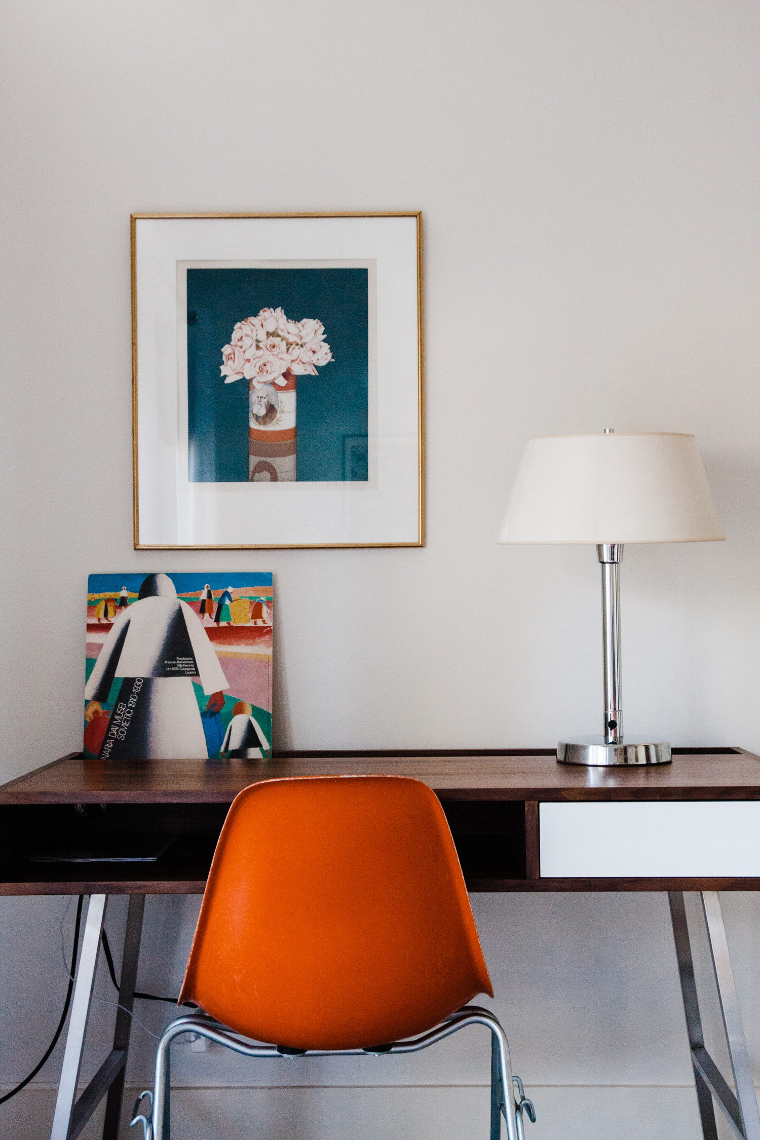
Annie wanted the guest room to also serve as a work space for her husband and teenage sons. With the large dresser now unnecessary (thanks to the new night stand), we brought in a modern, simple Gus* Modern desk and paired it with a vintage orange Herman Miller chair. Annie says her sons frequently use the desk and enjoy the peaceful work area.
We loved the simplicity of the Gus* Junction desk. it definitely added the sophisticated feel Annie wanted.
The orange vintage chair brought over the warm hues from the bed and gallery wall on the opposite side of the room.
Again, we placed a couple pieces from Annie's artwork collection in the new work area.
Annie had several rugs stashed away, so we brought one out to layer on top of the carpeted floors. Instantly more color and personality!
From boring and lifeless to colorful and collected
Annie, her family, and us Ashleys are thrilled with the guest room's transformation. Using mostly things already in her home, we added layers of color, texture and interest to a once boring space. Not only is the room now beautiful and more useful, but it is full of meaning for Annie with her personal art collection and family photographs now happily displayed.
Annie, thank you for inviting us into your beautiful home. You are delightful company, and the art-hanging partner we never knew we always wanted. Also you make delicious coffee; thank you for that as well. And your dogs are so nice.
Want help with your home like Annie?
We'd love to do a collaborative, fun styling session with you.


