The Many Arrangements of my Bungalow Entryway
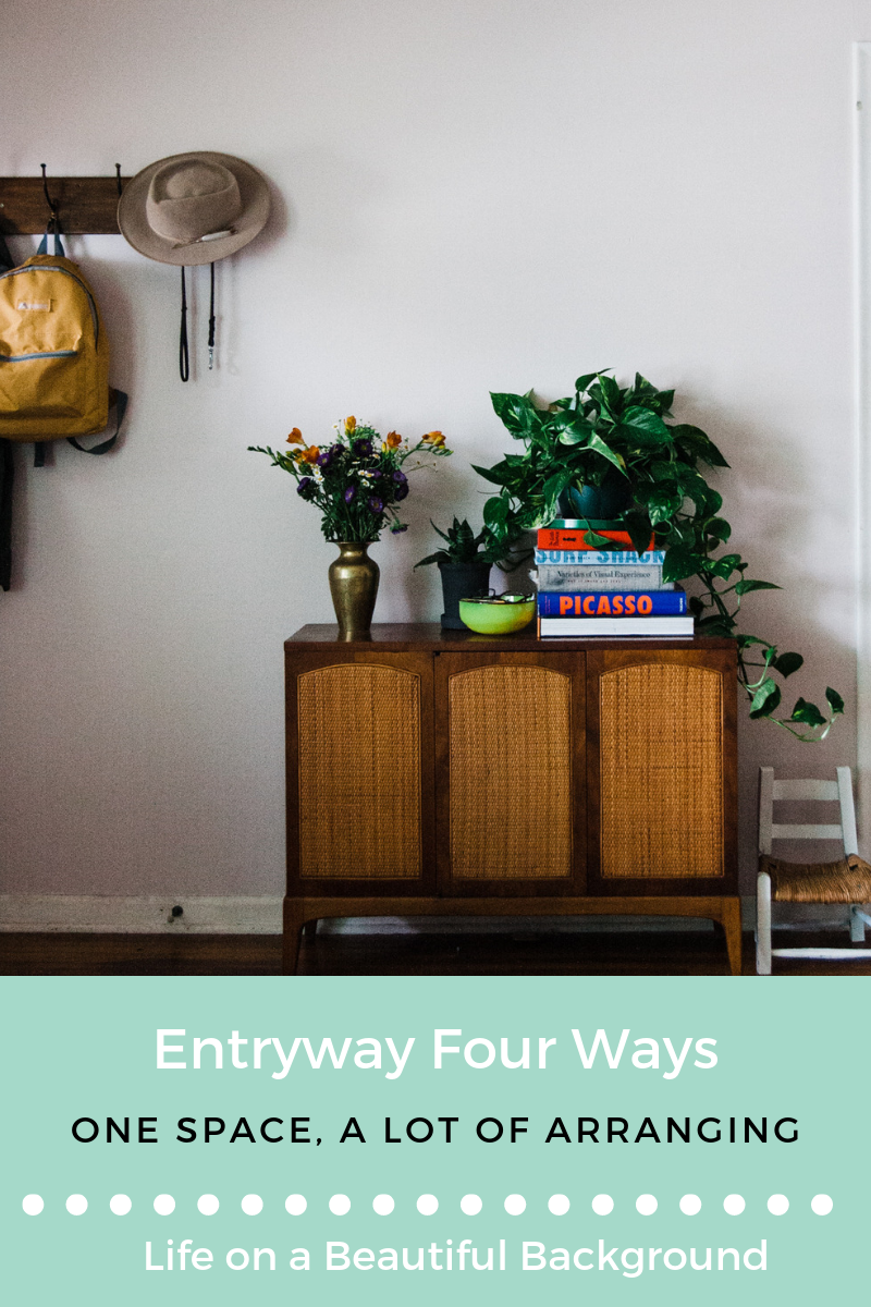
/Palmer is always hassling me to share photos of my constantly shifting home decor. She says it would be fascinating to see it all in a row, to study the photos together. "I would devour the hell out of those photos," she says. I dedicate this post about my entryway to Ashley Palmer. For her (and your!) viewing pleasure, please enjoy four different iterations of the first thing you see when you step into my home–the half wall just inside the front door.
This room is clearly the living room in our small bungalow; it's the biggest room, it's a central hub, and at the time, we thought the back sunroom was meant to be our guest room. We determined to put the television in this room and deciphered this entry wall as the right spot for it. Read more about that decision and other efforts to downplay the television here. Please note that on the other side of this wall is our toddler Harriet's room. She recently reached an age of awareness, and having the tv that close to her room in the evenings is just not in anyone's best interest.
This story is more about the entry wall than where our tv hangs, but so no one worries about my ability to spend time mesmerized by the glow of a large screen–we, of course, kept our television and moved it to our back sunroom/playroom/hangout room. Photos of that some day soonish. I promise.
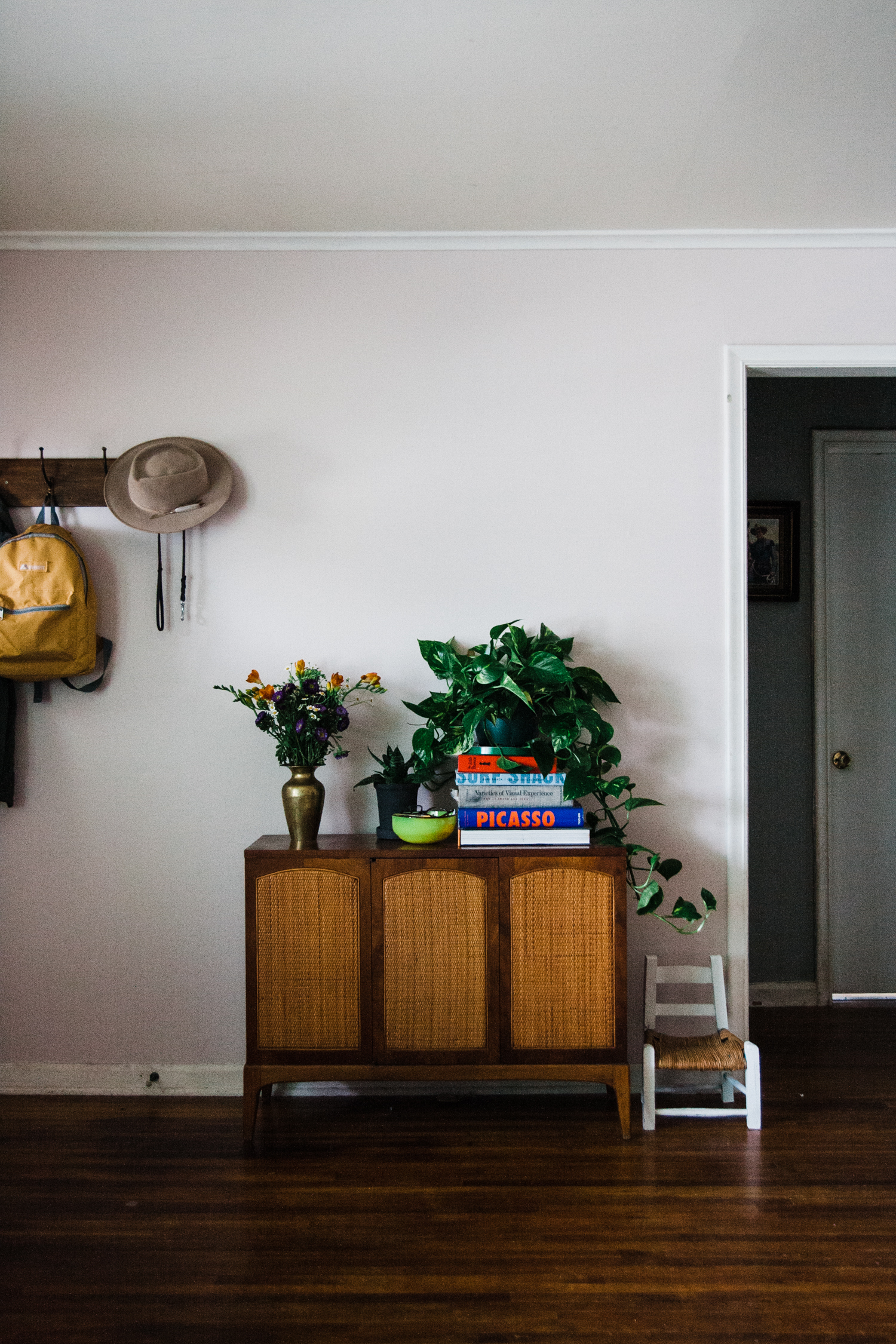
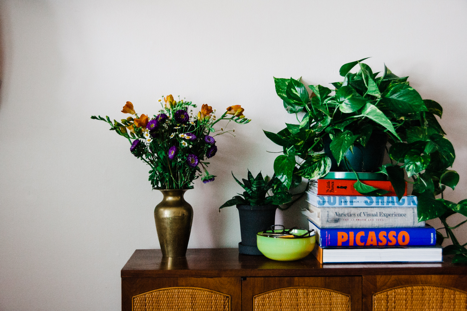
Meanwhile, sans TV there was a big blank space and some holes from the TV mounting hardware...I very cleverly stacked a lot of books and a large plant tall enough to block these holes. Please tell me I am not the only one to stack things in front of things to hide terrible things like holes or technology devices. Can anyone relate? Not a forever fix, but a fix for the moment, for visual peace of mind.
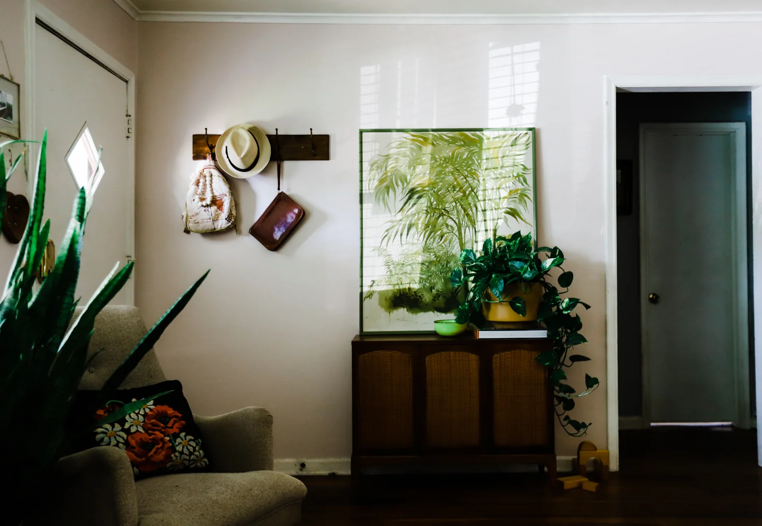
Before I could over-consider my next move (Rearrange furniture? Gallery wall? Long bench?), a big, lovely, planty piece of vintage art entered my life via Retro Den. I nabbed it up and leaned it over the blank space. As you can tell below, I removed a few books to lower the plant. Nice.
There was a great chance this is how things would have stayed for a very very long time, and that is why I started this blog post to show the progression of change in this part of my home. To be very honest, it is already different again...I have a piano in this spot now. I'll put new photos of that up as soon as I hang the amazing mirror I discovered to mount over it (since the plant art was too tall with the height of the piano).
I love decorating and rearranging and spending time with things I think are beautiful (furniture, art, my business partner Ashley Palmer, etc.).
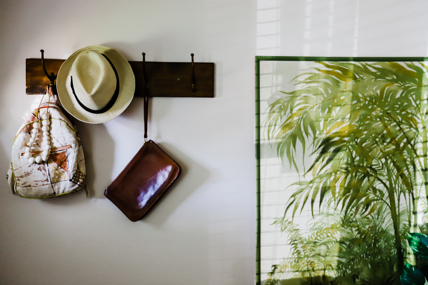
Look below to see just how things have shifted over a short span of time. The photos are kind of like a Where's Waldo and you can pick out what is slightly different all around the room, photo to photo...if that sounds fun to you. Does it? Then keep scrolling to see some details of our current version (well, current enough for this post!).
Version 1, herringbone!
Version 2, pink walls!
Version 3, NO TV!
Version 4, current version!
Honest moment: the reason I even thought to stack the books and put a plant there was because I needed to hide the hole where our tv cords once hid. Sometimes form follows function...or maybe you'd say form follows laziness.
“For what it costs us to go to a nice dinner or for what we paid for our last staycation thing...I had two experts show up at my home, transform the room that sets the tone for every single day of my life, and leave me with specific actions I could take starting immediately to continue to improve the space. ”
—Natasha Ball, Tulsa, OK


